True Confessions of a Benjamin Moore Color Consultant!

I’m confessing, I never liked Benjamin Moore’s 2020 Color of the year, “First Light”. A pale pink, went with gray in a weird kind of crazy way!
And the year before that, 2019 it was “Metropolitan”! Even worse, it looked like an old cement driveway. I had given up all hope until bam!!!! Finally a color a color consultant can use and incorporate into most client’s households already established colors! In fact, I’m so happy about this new color I’m all ready pulling fabrics to go with it!
Benjamin Moore’s
2021 Color Of The Year
is
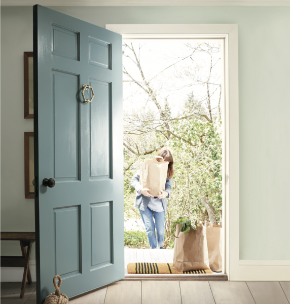
“ Aegean Teal “
A transitional mid-toned blue-green-gray hue!
Easy on the eyes, soothing to the senses and
beautiful in almost every style esthetic.
Take a look at all the images below in this restful and warm color!
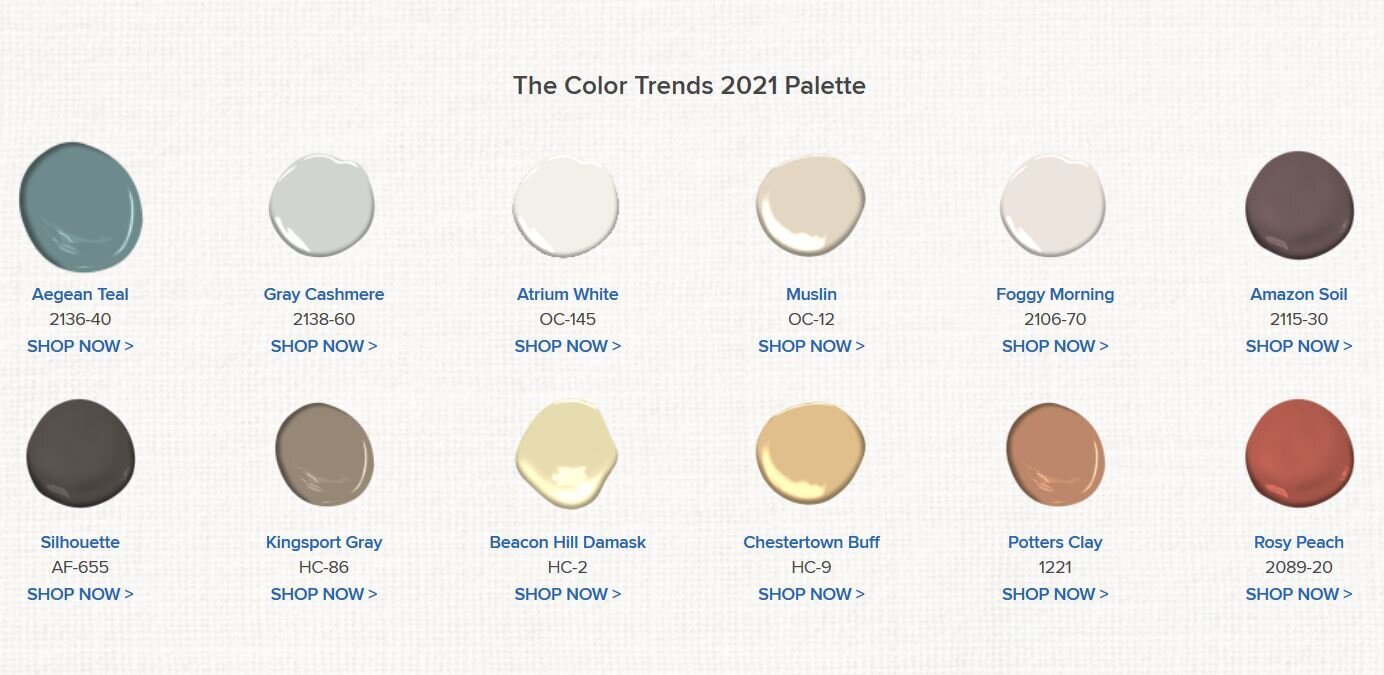
Here’s the whole line up of colors carefully selected to work flawlessly together in your home!
Nourish the spirit with the comforting, sunbaked hues of the Color Trends 2021 palette, including Aegean Teal 2136-40.
Celebrate the simple pleasures—think the faded rumple of linen sheets in the morning and perfectly ripened fruits on the windowsill. The twelve hues in the palette radiate warmth and wellbeing. These are colors that make your home feel even more like home. Settle in.
How Color Can Change the Way We Feel About Our Living Spaces
If white-on-white kitchens make you feel like taking a deep breath of air or if you've felt the serenity of light blues and grays, you've experienced the overwhelming power that color has on your emotional and physiological states.

In fact, it isn't merely the color itself that our brains interpret as mood-invoking, but also the shade, pattern and depth of that color. (e.g. A bright red alerts us to danger, puts us on edge and makes us salivate with hunger, while a deep burgundy can make us feel warm, passionate, and elegant. Additionally, small and repetitive patterns can make us feel regimented while large, flowing patterns bring out

One of my favorite ways to use a mid-tone color is to frame it with white! The contrast is a dramatic focal point in and of itself!
Color, depth, pattern, & lighting affect how we eat, sleep and work. And that's a good thing. Color gives you power over your home's appearance which also means that choosing the wrong color can have a detrimental result on all whom live in the home.

But don't worry - a professional "color consultant" is able to show you how to the perfect color for your home so that it appeals to everyone in the family!
If your living room color is a bit outdated or cookie-cutter..
If your home has great bones but a mediocre interior in about 50 different colors...
If you want to amaze yourself, family and friends time and time again with a space that speaks their language...

Yes, this is my desk while I choose colors for the exterior of a home. This project required three options from which one was approved by the HOA!
Sometimes we have limitations and restrictions to which I must abide! No problem! I've never met a house I couldn't choose colors for!

Toni Berry
Interior Designer & Decorator
I've been choosing Benjamin Moore paint colors for Bay Area Homes for 3 decades. And every client's colors has been different!. A home is only as happy as it's colors, so choose wisely. Stay healthy, happy and safe my friends.