Virtually Transformed: A Digital Rendering Before You Paint
This style home was very popular in the 2000’s when this specific home was built. Now for the DIGITAL TRANSFORMATION.
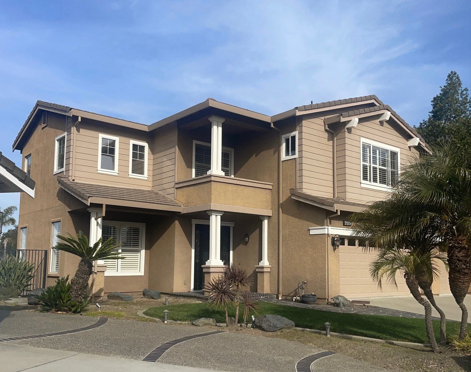
Here is how it looks today! Not bad by any means but aren’t we tired of California Tan with White trim? Yes, we are!
Here in the Bay Area, this home is a great example of Neo-Eclectic architecture. You’ll see this style all throughout suburban developments. It doesn’t stick to just one historical look — instead, it borrows from several. Think Mediterranean roof-lines, Colonial symmetry, maybe even a touch of Tudor detailing — all blended together into one cohesive design.
Let’s agree, it is now 2026 and it needs a COLOR REFRESH badly. Not that tan is a bad color, not at all. But watch as I change this home with a DIGITAL RENDERING just so you can see how good it would look in a couple of different paint color palettes.
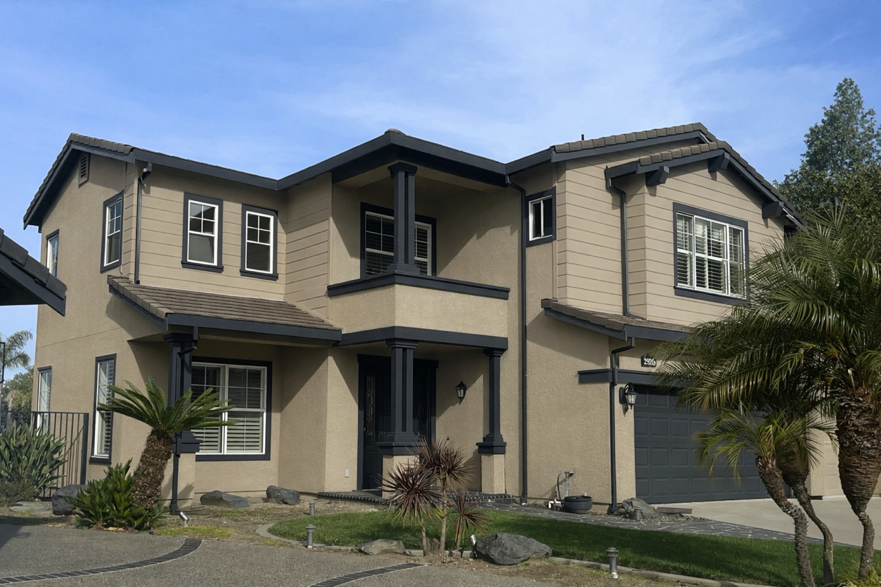
The homeowner suggested a dark and handsome color palette that would standout in the neighborhood. A bit austere and severe don’t you think? But to appease her I created a Digital Rendering in the colors she had in mind: Benjamin Moore Pashmina and Cheating Heart.
My first thoughts were, how can I make this home look like it was built today! And by creating a new paint color palette in this Digital Rendering is how I did it. She smiled, and she agreed, without a Rendering she could not have imagined it. But now, she can have her home painted with confidence.
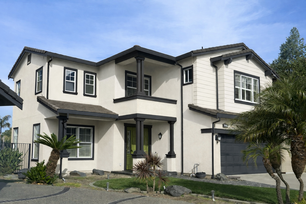
Ohhh I love this combo — it feels elevated but still totally livable. Let’s talk about what this palette is really doing for the home in a more relaxed, real-life way.
Painting the body in Benjamin Moore Wind’s Breath (OC-24) gives the house that soft, creamy warmth without going yellow. It’s not stark white and it’s not beige — it’s that perfect in-between that feels current and calm. In natural light, it reads clean and airy, but it still has enough depth so the house doesn’t look flat. It instantly modernizes the stucco and siding without making the home feel cold.
Now bringing in Dragon’s Breath (1547) on all the trim? That’s where the structure shows up. It’s a deep, rich charcoal with warmth, so it feels intentional and grounded — not harsh black. Using it on the fascia, window trim, posts, and garage door frames the architecture beautifully. It sharpens all the lines and makes the lighter body color look even more refined. The contrast feels strong, but not loud.
And then that front door in Tate Olive (HC-112) — that’s the personality moment. It adds depth and a subtle earthy vibe without screaming for attention. It’s sophisticated, slightly moody, and pairs beautifully with both Wind’s Breath and Dragon’s Breath. It feels curated, not trendy.
Overall, this palette feels fresh, timeless, and a little bit tailored. It softens the home while still giving it presence from the street. Calm body, bold trim, and a confident door — that’s a beautiful balance.
And here you go! From 2000 to 2026 the virtual transformation!
This side-by-side says it all — same home, completely different feel.
Digital Renderings allow you to see your actual home in its new colors before any paint is applied. Using your photos, I digitally place the selected body, trim, garage, and door colors directly onto your house so you can view the full transformation in context.
It takes the guesswork out of color selection and gives you confidence before making the investment.