The Drapery Color by Tiffany & Co.
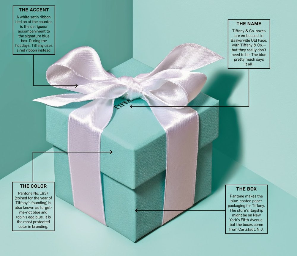

Some call it Robins Egg Blue or Forget Me Not Blue, I call
it delightful! The Pantone Color Institute executive director Leatrice Eiseman
said, “It evokes positive thoughts and reactions”. Loving the
color so much I just couldn’t resist using a comparable color for the new draperies in my
interior design office. After all, my
work is all about “positive thoughts (my designs), and positive reactions (from
you and in your home)!
Here are the steps taken to creating any custom window
treatment, for myself or for my clients.

Find the right fabric! This
is the first step and the one that takes the longest. I research many fabric company’s
offerings in a color close to the Tiffany & Co. blue. This entails combing
through lots of fabric books. I have 17 possible fabrics!

Order the fabric sample memos from the fabric company! I tape them
to the wall close to the window in which they will hang. I have 9 possible
fabrics and by process of elimination I have a winner!

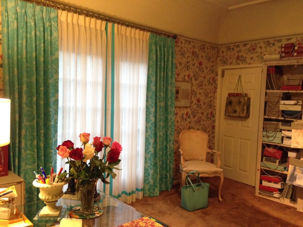
Design the window treatment! A classic style, straight French
Pleated panels flanking both sides of the french door on a simple brass rod. I
added off white sheer between the panels in the same style, again harkening back
to Tiffany’s white bow color combination. And in the spirit of my logo’s tag
line, “fashionably tailored spaces”,
I added a Tiffany Blue banding on the sheers to give them a tailored look.

Fabricate the drapery! Once the fabric, linings and hardware are
ordered, a detailed work order is given to our workroom that carefully and
skillfully cut and sews the drapery according to my custom measurements.

Installation Day! This is the day we see the vision come to fruition.
All the work in steps 1 through 4 is realized when we hang the drapery and
dress the window.
Color is a very big part of a room’s ambiance, and in this
case it set the stage for a sophisticated elegance that the room required. I
couldn’t be more pleased with my new draperies in my favorite Tiffany
& Co. color. And yes, it seems that Kate Spade also liked the color and used a comparable color on their "work tote bag" (as seen on the floor in the photos above)!